Pokazywanie postów oznaczonych etykietą grafika. Pokaż wszystkie posty

Place it

Umieść swoje screeny w realistycznych warunkach w ciągu kilku sekund.


Link: https://placeit.net

Fontello

Czcionki jak ikony.


Link: http://fontello.com/

JotForm

JotForm to darmowy generator formularzy online. W wersji darmowej istnieje ograniczenie do 100 formularzy miesięcznie. Brak reklam w gotowym formularzu.


Link: http://www.jotform.com/

Prefixr

Poprawney kod CSS we wszystkich przeglądarkach w przeciągu kilku sekund!


Link: http://prefixr.com/
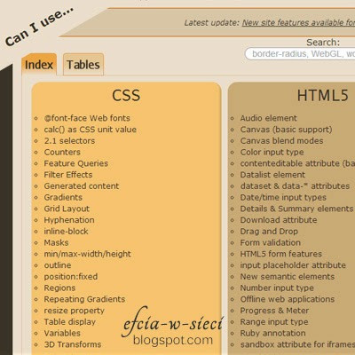
Can i use ..

Tabele zgodności wsparcia HTML5, CSS3, SVG na podstawie przeglądarek desktopowych i mobilnych.


Link: http://caniuse.com/

Lorem pixel

Po wybraniu rozdzielczości (i ew. kategorii) obrazka, otrzymujemy jeden adres url przedstawiający obrazek spełniający nasze kryteria. Co ciekawe, link jest jeden, natomiast z każdym odświeżeniem otrzymujemy inny obrazek.

Dopisując na końcu adresu /jakiś_tekst/, uzyskamy znak wodny w lewej części obrazka.


Link: http://lorempixel.com/

Responsive Design Bookmarklet

Poręczne narzędzie do testowania wyglądu stron przy różnych rozdzielczościach.

Aby z niego skorzystać, należy dodać button do zakładek a następnie uruchomić go na testowanej witrynie internetowej.


Link: http://responsive.victorcoulon.fr/

Drugie alternatywne narzędzie - http://www.responsinator.com/

JPEGmini

Zmniejszenie rozmiaru pliku zdjęć nawet do 5x, przy zachowaniu ich oryginalnej jakości i formatu JPEG.


Link: http://www.jpegmini.com/

Color Hailpixel

Prosty sposób eksperymentowania z kolorami.


Link: http://color.hailpixel.com/

Animate.css

Zbiór animacji CSS działających w różnych przeglądarkach do wykorzystania w swoich projektach.


Link: http://daneden.github.io/animate.css/

Narzędzia dla designerów

Szablon do wykorzystania na stronach internetowych. Początkowo wszystkie elementy są widoczne, jednak po wskazaniu kursorem jednego z nich - wybrany zostaje przedstawiony jak dotychczas, natomiast inne elementy (grafika i tekst) stają się półprzezroczyste.


Źródło: http://cssdeck.com/labs/css-only-pinterest-style-columns-layout

HTML

<div id="wrapper"> <div id="columns"> <div class="pin"> <img src="https://lh3.googleusercontent.com/blogger_img_proxy/AEn0k_uhm2lxicMstLVKtjDbkE9GETH0TwKuhDmhEFRmDh8S5m7KMvr-mZD1ExgBCkYmd3nzxDx4S0HM6FjYplD0CrBgF90ZNCpr3Y4fTtzW7rxr2bB_ryeCe9g=s0-d"> <p> Lorem ipsum dolor sit amet, consectetur adipiscing elit. Sed feugiat consectetur pellentesque. Nam ac elit risus, ac blandit dui. Duis rutrum porta tortor ut convallis. Duis rutrum porta tortor ut convallis. </p> </div> <div class="pin"> <img src="https://lh3.googleusercontent.com/blogger_img_proxy/AEn0k_tdmseqonHTJOqr7wDhZw8XyqoHCiJ1gUdHbbTBHqflzQyWSjt8QHNyP3RfyL9ipW9vQno_7lPUc60VQXW0r-EmgvMveNDxLsnfVwnWJdONt7EHfNeMns8=s0-d"> <p> Donec a fermentum nisi. </p> </div> <div class="pin"> <img src="https://lh3.googleusercontent.com/blogger_img_proxy/AEn0k_vodV86TFlNQ9CMOOMyk9ZQGW7EDO8wY7sZoXq83PQBbADwIWrlOalRpAFH3Sy6mPwbcLwwKdOAZdEloSuR4XlY2Wgs_MIvFb473egXao3LFEi1SI4GkVU=s0-d"> <p> Lorem ipsum dolor sit amet, consectetur adipiscing elit. Sed feugiat consectetur pellentesque. Nam ac elit risus, ac blandit dui. Duis rutrum porta tortor ut convallis. </p> </div> </div> </div>

CSS

body { background: url(http://subtlepatterns.com/patterns/scribble_light.png) ; } #wrapper { width: 90%; max-width: 1100px; min-width: 800px; margin: 50px auto; } #columns { -webkit-column-count: 3; -webkit-column-gap: 10px; -webkit-column-fill: auto; -moz-column-count: 3; -moz-column-gap: 10px; -moz-column-fill: auto; column-count: 3; column-gap: 15px; column-fill: auto; } .pin { display: inline-block; background: #FEFEFE; border: 2px solid #FAFAFA; box-shadow: 0 1px 2px rgba(34, 25, 25, 0.4); margin: 0 2px 15px; -webkit-column-break-inside: avoid; -moz-column-break-inside: avoid; column-break-inside: avoid; padding: 15px; padding-bottom: 5px; background: -webkit-linear-gradient(45deg, #FFF, #F9F9F9); opacity: 1; -webkit-transition: all .2s ease; -moz-transition: all .2s ease; -o-transition: all .2s ease; transition: all .2s ease; } .pin img { width: 100%; border-bottom: 1px solid #ccc; padding-bottom: 15px; margin-bottom: 5px; } .pin p { font: 12px/18px Arial, sans-serif; color: #333; margin: 0; } @media (min-width: 960px) { #columns { -webkit-column-count: 4; -moz-column-count: 4; column-count: 4; } } @media (min-width: 1100px) { #columns { -webkit-column-count: 5; -moz-column-count: 5; column-count: 5; } } #columns:hover .pin:not(:hover) { opacity: 0.4; }

CSS - Layout z efektem Hover (inspiracja: Pinterest)

Wstawiamy dowolne zdjęcie, natomiast całą resztę bierze na siebie CSS. W efekcie otrzymujemy poświatę naokoło ramki- wszystko oczywiście dopasowane kolorystycznie.

Najlepszy efekt uzyskamy na ciemnym tle.

Wykorzystuje filtry SVG.


Źródło: http://cssdeck.com/labs/ambi-glow

HTML

<pre class="brush:html"><!--[if lt IE 7]> <div class="wrapper lt-ie10 lt-ie9 lt-ie8 lt-ie7"> <![endif]--> <!--[if IE 7]> <div class="wrapper lt-ie10 lt-ie9 lt-ie8"> <![endif]--> <!--[if IE 8]> <div class="wrapper lt-ie10 lt-ie9"> <![endif]--> <!--[if IE 9]> <div class="wrapper lt-ie10"> <![endif]--> <!--[if gt IE 9]><!--> <div class="wrapper"> <!--<![endif]--> <div class="centered"> <div class="inner"> <img alt="nostalgia by Nikos Zacharoulis" class="pic" height="280" src="https://lh3.googleusercontent.com/blogger_img_proxy/AEn0k_uMrctxgA8MJaqmCr7N6VR3gsoDrxmBmhcd7x-0xDM4nKrtIiD7PIdb2BZ2wBJHvUlI1rq2BHuwB5YB6ZxbGwQtG3QSWziCtYPLX35PXQYec6-uxZtdS2jeIPVVGsKCimfOTUBO0juoOkc-2Z62myE=s0-d" width="280"> </div> </div> <!--[if lte IE 9]> <img class="ie-fallback-bg-blur" src="http://pcdn.500px.net/27549003/d409bce305cd0f77f3b12d124f69c7a3659bfaea/3.jpg" width="280" height="280" alt="nostalgia by Nikos Zacharoulis"> <![endif]--> <svg class="bg-blur"> <defs> <filter height="400%" id="blur" width="400%" x="-200%" y="-200%"> <fegaussianblur in="SourceGraphic" stddeviation="70"> </fegaussianblur></filter> </defs> <image filter="url(#blur)" height="280" id="svg-image" width="280" x="150" xlink:href="http://pcdn.500px.net/27549003/d409bce305cd0f77f3b12d124f69c7a3659bfaea/3.jpg" y="150"> </image></svg> <!-- Supported: IE 10 Firefox 3+ Chrome 8+ Safari 6 Opera 9+ Opera mini Opera Mobile 10 Chrome for Android Firefox for Android Fallback to IE-filters in IE9 and below Not supported: Safari 5.1 and below Android Browser 4.2 and below iOS Safari 5.1 and below http://caniuse.com/#feat=svg-filters -->

CSS

/* author: Paul Radzkov http://paulradzkov.com/2013/gaussian_blur/ */ html, body { margin: 0; padding: 0; height: 100%; width: 100%; } html { display: table; } body { display: table-cell; vertical-align: middle; text-align: center; background: black; color: #FFF; } .centered { position: relative; z-index: 1; float: left; left: 50%; } .centered .inner { position: relative; left: -50%; } /* positioning for IE7 */ .lt-ie8 .centered { position: absolute; top: 50%; } .lt-ie8 .centered .inner { top:-50%; } /* blur position */ .bg-blur { height: 580px; width: 580px; position: absolute; left: 50%; top: 50%; margin-left: -290px; margin-top: -290px; z-index: 0; } /* IE fallback */ .lt-ie10 #svg-image { display: none; } .ie-fallback-bg-blur { height: 280px; width: 280px; padding: 80px; position: absolute; left: 50%; top: 50%; margin-left: -290px; margin-top: -290px; z-index: 0; filter: progid:DXImageTransform.Microsoft.Blur(pixelradius=70); } /* decoration */ .pic { display: block; border: 1px solid rgba(0,0,0,0.5); box-shadow: 0 5px 15px rgba(0,0,0,0.5), 0 3px 5px rgba(0,0,0,0.2); } .inner:before { content: ''; position: absolute; top: 1px; right: 1px; bottom: 1px; left: 1px; box-shadow: inset 0 0 0 1px rgba(255,255,255,0.15); }

CSS3 - Otaczająca poświata (ambient glow)

Po najechaniu kursorem na grafikę, pojawia się lupa. Sporadycznie spotykany efekt, wyglądający bardzo estetycznie.


Źródło: http://cssdeck.com/labs/magnifying-glass-plugin-with-jquery-and-css3

HTML

<link href="//fonts.googleapis.com/css?family=Ubuntu" rel="stylesheet" type="text/css"> <div id="wrap"> <h1>Super Cool Magnifying Glass For Image Zoom</h1> <h2>Demo</h2> <div class="product"><img class="magniflier" src="https://lh3.googleusercontent.com/blogger_img_proxy/AEn0k_sEOSdr0gzExYKKNq2KgthJ2YQ3JF8XYDojtt0Km2647Oo4KVetNeHDxRsrxzGnckyRT9gfj4SEGsWueORwqSbcG-cl21DPbAMrY2Mk2xlycISHNDup=s0-d" width="300"></div> <div class="product"><img class="magniflier" src="https://lh3.googleusercontent.com/blogger_img_proxy/AEn0k_u4el0iwtmHBroP5KXHQ6ko6RnKdi6JZtlVZXp1uHwdUD7pnvppnPaAiV499Uvs6VwOWT96NtE0sjtc3H8J8_BiCpAnCCVIGQimnuP6W3DQjozSrrk=s0-d" width="300"></div> <div class="product"><img class="magniflier" src="https://lh3.googleusercontent.com/blogger_img_proxy/AEn0k_sV27ns94spCQctuXOtX3sa2sNHcH_mmp4RZdSK5msu_QghN6P_Y-2CZbV8aSZmua4bKleF3lCkm2Jts3UQ5imuuYnOTtiF4krQmXXSOI71RMBpDDjP=s0-d" width="300"></div> <h2>Usage</h2> <p><a href="http://codetheory.in/image-zoom-magnifying-glass-effect-with-css3-and-jquery/">Read this Article</a></p> </div> <!-- Time for jquery action --> <script src="//cdnjs.cloudflare.com/ajax/libs/jquery/1.8.2/jquery.min.js"></script>

CSS

.glass { width: 175px; height: 175px; position: absolute; border-radius: 50%; cursor: crosshair; /* Multiple box shadows to achieve the glass effect */ box-shadow: 0 0 0 7px rgba(255, 255, 255, 0.85), 0 0 7px 7px rgba(0, 0, 0, 0.25), inset 0 0 40px 2px rgba(0, 0, 0, 0.25); /* hide the glass by default */ display: none; } /********* *** Styles just for DEMO purpose *********/ body{ background: black url(http://subtlepatterns.subtlepatterns.netdna-cdn.com/patterns/wild_oliva.png); font-family: 'ubuntu', arial, verdana; color: #fff; font-size: 14px; } #wrap { max-width: 700px; margin: 20px auto; } .product { margin: 20px auto; text-align: center; padding: 20px; } h1, h2, h3 { text-align: center; margin: 50px 0; font-size: 30px; color: #fff; text-shadow: 0 1px 5px rgba(0, 0, 0, 0.75); } h2 { font-size: 26px; margin: 25px 0; } a { color: white; }

JS

$(function() { var native_width = 0; var native_height = 0; var mouse = {x: 0, y: 0}; var magnify; var cur_img; var ui = { magniflier: $('.magniflier') }; // Add the magnifying glass if (ui.magniflier.length) { var div = document.createElement('div'); div.setAttribute('class', 'glass'); ui.glass = $(div); $('body').append(div); } // All the magnifying will happen on "mousemove" var mouseMove = function(e) { var $el = $(this); // Container offset relative to document var magnify_offset = cur_img.offset(); // Mouse position relative to container // pageX/pageY - container's offsetLeft/offetTop mouse.x = e.pageX - magnify_offset.left; mouse.y = e.pageY - magnify_offset.top; // The Magnifying glass should only show up when the mouse is inside // It is important to note that attaching mouseout and then hiding // the glass wont work cuz mouse will never be out due to the glass // being inside the parent and having a higher z-index (positioned above) if ( mouse.x < cur_img.width() && mouse.y < cur_img.height() && mouse.x > 0 && mouse.y > 0 ) { magnify(e); } else { ui.glass.fadeOut(100); } return; }; var magnify = function(e) { // The background position of div.glass will be // changed according to the position // of the mouse over the img.magniflier // // So we will get the ratio of the pixel // under the mouse with respect // to the image and use that to position the // large image inside the magnifying glass var rx = Math.round(mouse.x/cur_img.width()*native_width - ui.glass.width()/2)*-1; var ry = Math.round(mouse.y/cur_img.height()*native_height - ui.glass.height()/2)*-1; var bg_pos = rx + "px " + ry + "px"; // Calculate pos for magnifying glass // // Easy Logic: Deduct half of width/height // from mouse pos. // var glass_left = mouse.x - ui.glass.width() / 2; // var glass_top = mouse.y - ui.glass.height() / 2; var glass_left = e.pageX - ui.glass.width() / 2; var glass_top = e.pageY - ui.glass.height() / 2; //console.log(glass_left, glass_top, bg_pos) // Now, if you hover on the image, you should // see the magnifying glass in action ui.glass.css({ left: glass_left, top: glass_top, backgroundPosition: bg_pos }); return; }; $('.magniflier').on('mousemove', function() { ui.glass.fadeIn(100); cur_img = $(this); var large_img_loaded = cur_img.data('large-img-loaded'); var src = cur_img.data('large') || cur_img.attr('src'); // Set large-img-loaded to true // cur_img.data('large-img-loaded', true) if (src) { ui.glass.css({ 'background-image': 'url(' + src + ')', 'background-repeat': 'no-repeat' }); } // When the user hovers on the image, the script will first calculate // the native dimensions if they don't exist. Only after the native dimensions // are available, the script will show the zoomed version. //if(!native_width && !native_height) { if (!cur_img.data('native_width')) { // This will create a new image object with the same image as that in .small // We cannot directly get the dimensions from .small because of the // width specified to 200px in the html. To get the actual dimensions we have // created this image object. var image_object = new Image(); image_object.onload = function() { // This code is wrapped in the .load function which is important. // width and height of the object would return 0 if accessed before // the image gets loaded. native_width = image_object.width; native_height = image_object.height; cur_img.data('native_width', native_width); cur_img.data('native_height', native_height); //console.log(native_width, native_height); mouseMove.apply(this, arguments); ui.glass.on('mousemove', mouseMove); }; image_object.src = src; return; } else { native_width = cur_img.data('native_width'); native_height = cur_img.data('native_height'); } //} //console.log(native_width, native_height); mouseMove.apply(this, arguments); ui.glass.on('mousemove', mouseMove); }); ui.glass.on('mouseout', function() { ui.glass.off('mousemove', mouseMove); }); });

CSS+JS hover zoom effect


Nie wszyscy wiedzą, że nie potrzebujemy programu graficznego, aby wydobyć palety głównych kolorów z jakiegoś zdjęcia. Wykorzystanie prostego narzędzia, jakim jest Colors Pallete Generator nie tylko skróci nam cały proces, lecz również od razu podzieli wydobyte kolory na kategorie - palety jasne, średnie, ciemne, oraz paleta ogólna. Do każdego z wyodrębnionych kolorów dostajemy jego nazwę w postaci #000000.
Korzystanie z generatora jest bajecznie proste. Początkowo należy wgrać na serwer interesującą nas grafikę (możemy to zrobić wpisując adres url lub wybierając plik z naszego komputera); wgrywanie rozpoczynamy klikając GET PALETTE.
    O czym należy wiedzieć?
  • Maksymalny rozmiar załączonego pliku graficznego: 1MB
  • Dopuszczalne rozszerzenia: .png, .gif, .jpg, .jpeg
  • Uzyskane palety możemy zapisać w postaci pliku *.css lub swatch'y do Photoshop'a *.aco
Źródło: http://www.cssdrive.com/imagepalette/index.php

Colors Pallete Generator - palety kolorów ze zdjęcia